
A smart-home app that uses AI to propose routines for the user to approve or edit, instead of asking them to wire up if-this-then-that rules from scratch. Common controls sit one tap from the surface; everything else is one or two taps deeper.
early storyboards and sketches
Research
We audited the major smart-home apps — Google Home, Apple Home, SmartThings, Hubitat — for two patterns: what every app converges on, and where it breaks down. The shared core (rooms, devices, scenes) is solved. The breakdowns cluster in the automation builder, where the user has to compose conditional rules that quickly outgrow what the interface can hold.
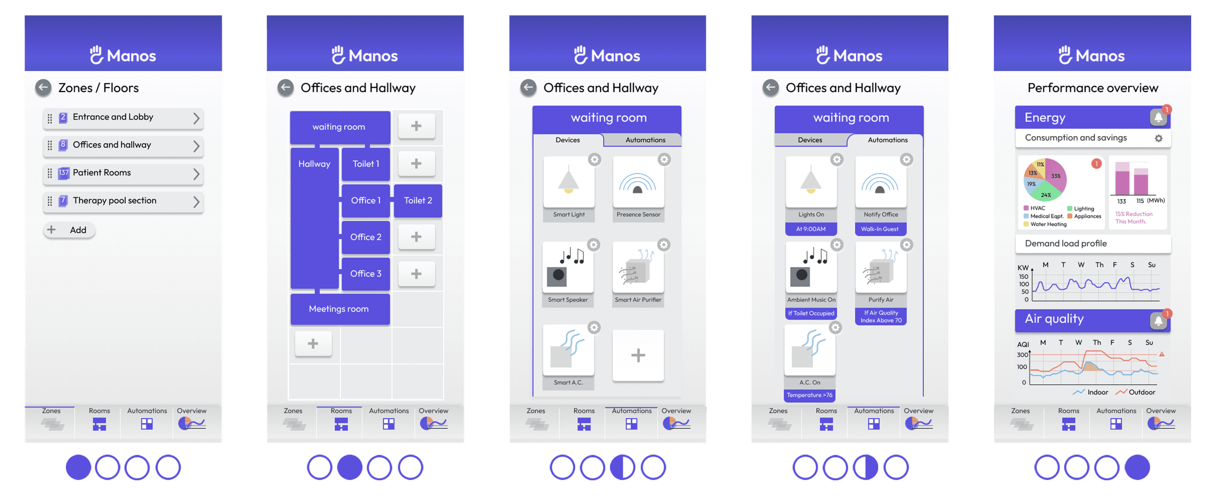
The interactive prototypes test that breakdown directly. They model the full hierarchy — space, room, device, automation — so the information-architecture decisions hold up at realistic device counts, not just on the happy path.
Information Architecture
We built the information architecture around two constraints that usually pull in different directions: the back-end groupings the platform's data model imposes, and the user's mental model of how their home is organized. The tab order descends in scope — space, room, device, automation, settings — so each tab answers one question at one zoom level.
We kept one primary action per screen and pushed optional controls into dropdowns and reveal-on-tap elements. A user managing a five-device home should reach that action in the same number of taps as a user managing fifty; the extra complexity gets nested deeper, not spread across the top level.
Visual Design
The visual system uses color as a pointer. Whites and greys are the chrome; a single purple marks whatever the current tab is editing — a room, device, or automation. The user can glance at any screen and know which noun is in focus without reading a label.
The icon set was drawn from a shared base so a device and the automation that controls it look related. A user shouldn't have to re-learn what an icon means when they cross a tab boundary.
Notes
Footnotes
-
Nielsen, J. (2006). Progressive disclosure. Nielsen Norman Group. https://www.nngroup.com/articles/progressive-disclosure/ ↩